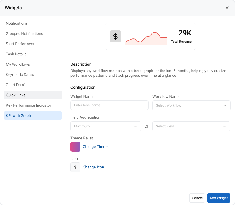
The KPI with Graph feature allows end users to visualize workflow performance metrics directly on the dashboard. It aggregates key values such as totals, averages, counts, or minimum/maximum values from workflow data created or updated within the last 6 months.
With flexible configuration options, predefined themes, and a built-in month-wise trend graph,the KPI with Graph widget delivers instant, high-level insights into workflow efficiency.
Steps to Enable KPI with Graph in Dashboard (End User)
1. Open Dashboard
Navigate to the dashboard where you want to add the KPI with Graph widget.
2. Click Edit Dashboard & Click “Add Widget”
Click Edit Dashboard and Click Add Widget button on the dashboard.
3. Select Widget Type
Choose KPI with Graph from the list of widget types.
4. Enter Label
Provide a name for this widget. This label will appear on the dashboard.
5. Select Workflow
Choose the workflow from which the widget should pull data.
6. Select Aggregation Function
Choose an aggregation function based on the target field type:
– Count → Works for string and numeric fields
– Sum, Avg, Min, Max → Works only for numeric fields (integer, decimal, currency)
7. Select Workflow Field
Choose the workflow field you want to aggregate.
– Supported fields will be enabled
– Unsupported fields (Table, File, Multi-select, etc.) will be disabled
8. Select Theme
Choose a visual theme for the widget:
– Default app theme
– Single color
– Gradient
Color picker is restricted to the predefined palette.
9. Optionally Assign an Icon
Select an icon from the available icon set (optional).
![]()
10. Click “Add Widget”
Save the configuration to add the KPI with Graph widget to your dashboard.
Note: Data is calculated based on the last 6 months.
11. View the Widget
The KPI with Graph widget displays:
– The KPI value
– The aggregation label
– The optional icon
New: A month-wise trend graph for the last 6 months is included below the KPI value.
Supported Aggregations & Field Types
| String | Count |
|---|---|
| Integer / Decimal / Currency | Sum, Count, Avg, Min, Max |
Unsupported Field Types
The following fields cannot be used for KPI with Graph:
– Table, Text Area, Checkbox, Radio Button, Multi-select Dropdown, URL, File Upload, Signature, Time, HTML Editor, Terms & Conditions
Summary
The KPI with Graph feature provides users a visual and analytical summary of workflow
performance over the last 6 months. With configurable themes, optional icons, and a built-in
trend graph, it offers a clear, quick understanding of key workflow metrics directly on the
dashboard.
FAQ
Q1. How is the KPI value calculated?
KPI values are calculated based on workflow records created or updated within the last 6 months.
Q2. Can I change the data period (e.g., last 3 months or 1 year)?
Not in this version. The KPI widget always uses a fixed 6-month data window.
Q3. Which fields are supported?
Only String, Integer, Decimal, and Currency fields are supported.
Q4. What aggregation functions can I use?
Count for all supported fields (including String).
Sum, Avg, Min, Max only for numeric fields (Integer, Decimal, Currency).
Q5. Can I use my own colors?
No. You can only select from the predefined color palettes provided in the application.
Q6. Is the icon mandatory?
Yes, it is mandatory.
Q7. How often does the data refresh?
The KPI recalculates whenever the dashboard is reloaded or workflow data is updated.
Q8. Can I create multiple KPI widgets for one workflow?
Yes, you can add multiple KPI widgets for different fields and aggregations within the same workflow.
Q9. Are complex fields like tables or multi-select supported?
No. Only simple data fields are supported in the KPI widget.
Q10. What does the graph show?
The graph displays month-wise aggregated data for the last 6 months, reflecting trends for the selected
workflow field and aggregation type.
