Dashboard Reports in Cflow allow you to visually track, analyze, and display key performance indicators (KPIs), metrics, and vital data points to assess the health of workflows, departments, or business processes.
To create a custom Dashboard Report, follow these steps:
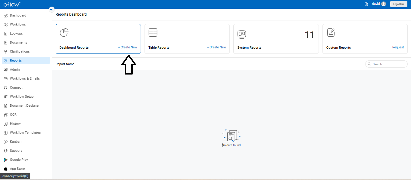
- From the left navigation menu, click Reports.
- Select Dashboard Reports.
- Click +Create New to begin building your report.
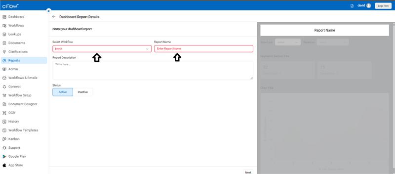
Name Your Report
- Choose the workflow from the dropdown.
- Enter a Report Name and an optional description for clarity.
- Set the Status to Active or Inactive.
Configure Your Chart
- Enter a Chart Title.
- Specify the X-Axis Display Name and Y-Axis Display Name.
- Choose the Chart Type (e.g., bar, line, pie).
- Use Default Data Filtering Rule to filter chart data based on a reference field (like Submitted Date).
- Fill in optional fields like Section Title, Data Point Aggregation, and Key Metric Aggregation.
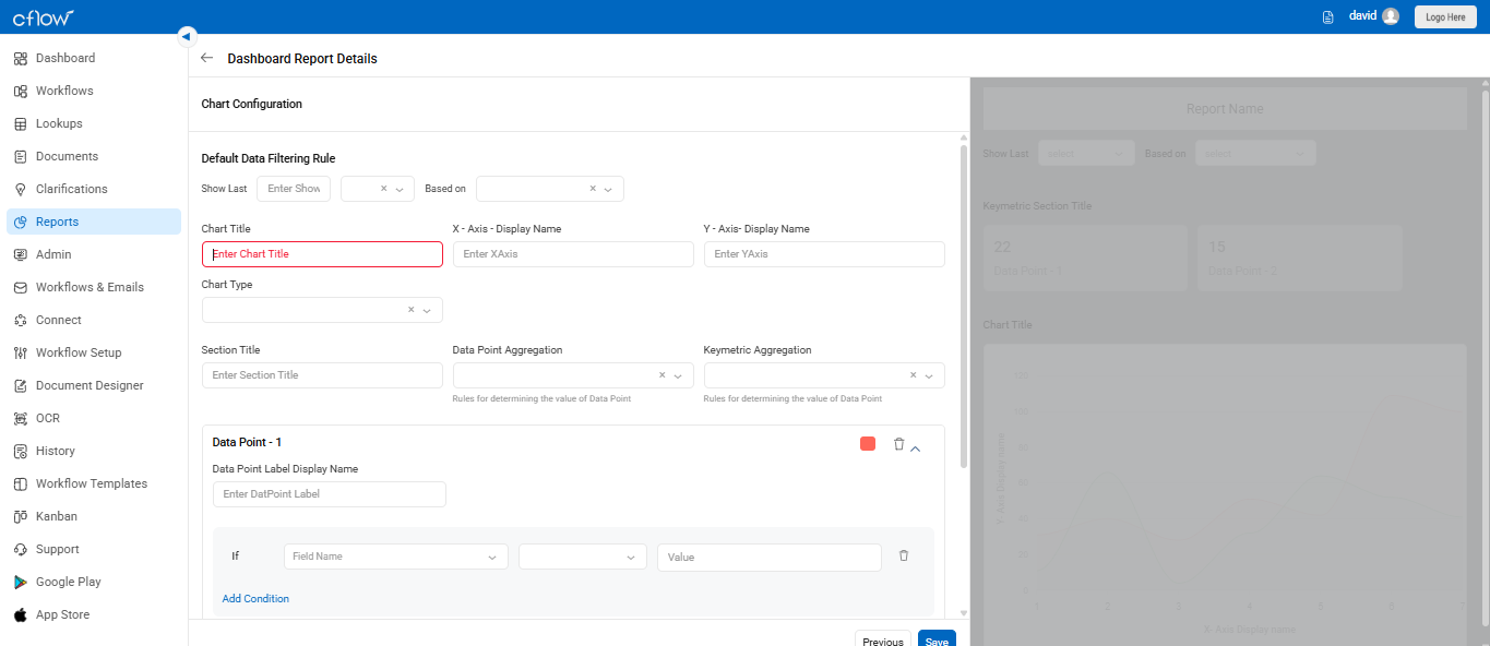
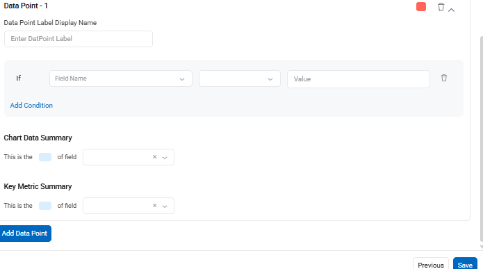
Add Data Points
- Each chart can contain multiple data points (up to 10). A Data Point is a value derived based on your rules and conditions.
- Enter a Data Point Label Display Name.
- Define the rule using the If condition with a field, operator, and value.
- Optionally, add rules for Chart Data Summary and Key Metric Summary using dropdown fields.
- Click Add Data Point to add more data points as needed.
After setting up all required fields and conditions, click Save to complete the Dashboard Report setup.