Forms Overview
Forms refer to the structured templates that are used to capture and collect data from users within a workflow. These forms act as digital representations of paper-based forms and enable the efficient and organized collection of information at various stages of a workflow.
In Cflow, forms typically consist of fields, such as text fields, checkboxes, dropdown lists, date pickers, and attachments, which allow users to input and submit data. These fields can be customized and configured based on the specific requirements of the workflow and the information that needs to be collected.
You access the form builder from:
Workflow Setup → Workflows → Form Creation
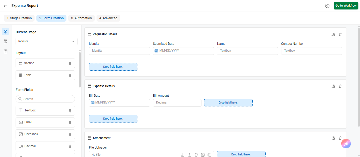
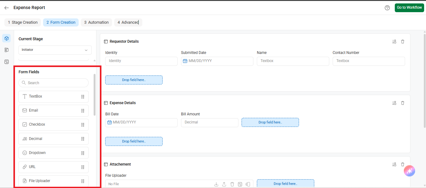
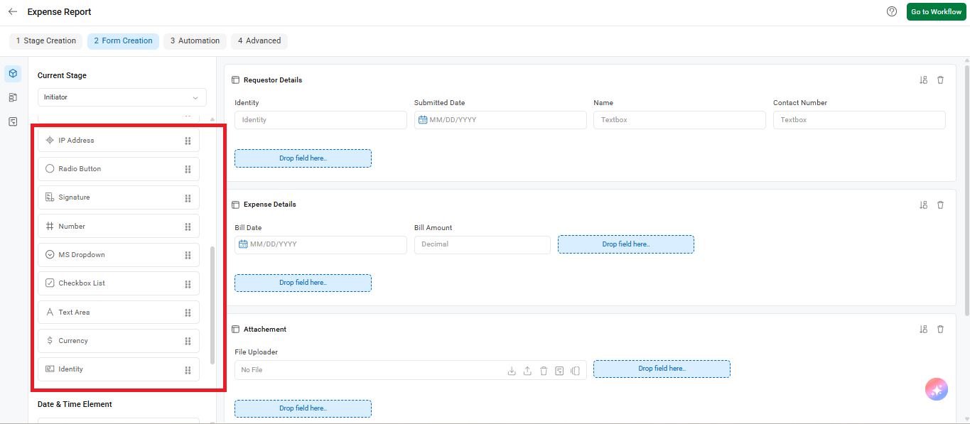
The left panel displays a variety of Form Fields such as TextBox, Email, Checkbox, Decimal, Dropdown, URL, File Uploader, Radio Button, Number, Signature, Currency, Identity, and more.
These fields can be dragged and dropped into sections or tables to build your form layout visually.
Cflow’s form builder
The form builder in Cflow provides a live view, allowing users to design forms with a “what-you-see-is-what-you-get” approach. It offers two containers, namely sections, and tables, which assist in creating visually appealing and interactive forms.
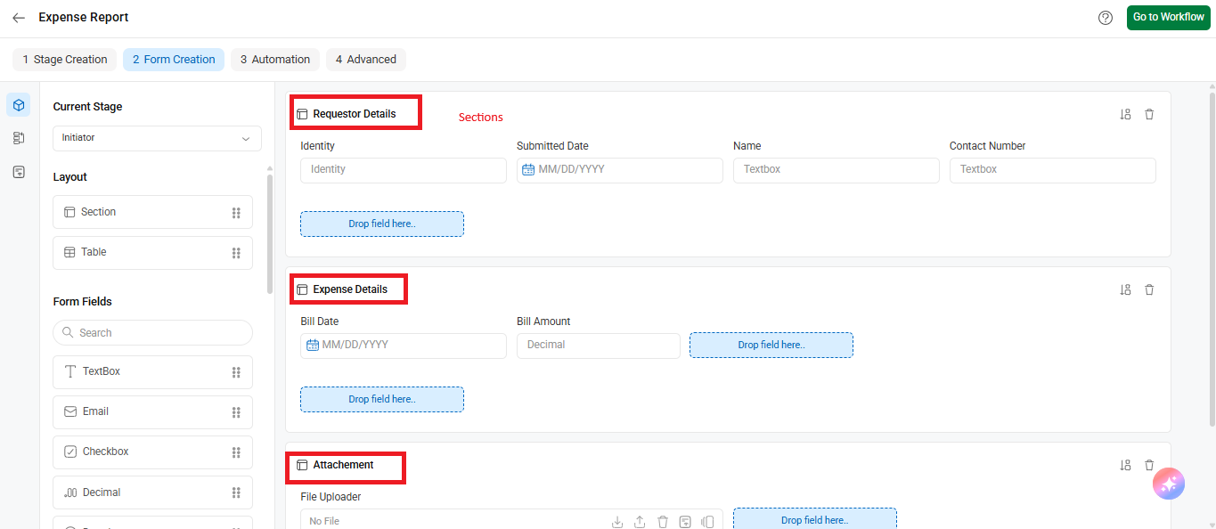
Sections
Sections are components within forms that help structure and group related fields together. They are the containers for placing the fields. Sections allow for a logical and intuitive presentation of form fields, improving the user experience and facilitating efficient data entry.
Sections are used to group related fields. For example, the “Requester Details,” “Expense Details,” and “Attachment”
Using the form builder’s advanced features, users can design dynamic forms and fields by leveraging various HTML controls. Within each section, users can arrange controls row-wise, with a maximum of five controls per row. Additionally, users have the flexibility to adjust the width of the controls, providing customization options.
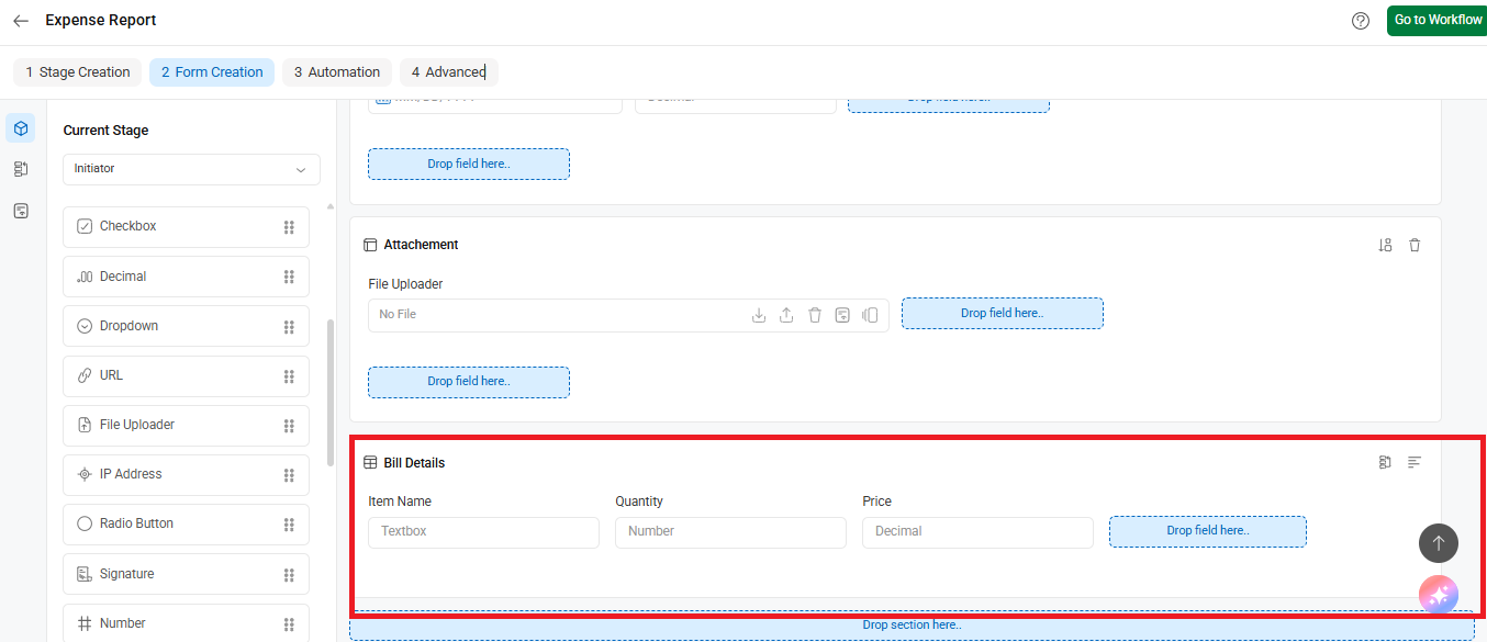
Tables
Tables are used to capture and present tabular data within a form. They allow users to input data in a structured format, similar to a spreadsheet or grid. Tables in forms are particularly useful for scenarios where multiple rows of data need to be entered, such as adding multiple items, listing details, or capturing repetitive information.
In the table section, users can create columns and place controls within them. You may also resize controls to optimize the space in the table section.
To enhance usability, the advanced form builder supports keyboard controls for easy navigation across fields. It also allows power users to save properties, facilitating efficient form-building workflows.
Adding a new table
The table container is designed to accommodate controls in a column-wise arrangement.
- A maximum of 8 tables can be created within the form.
- Table controls do not have a fixed limit on their width, providing flexibility in design and layout.
For example, the “Bill Details” table includes fields such as Item Name (Textbox), Quantity (Number), and Price (Decimal).
Fields
Fields serve as the fundamental building blocks of your form. They provide the essential medium through which users can provide information, enabling a seamless flow of data capture and interaction. These fields allow users to enter information, make selections, or perform actions within the form.
Common types of fields found in forms include:
- Text fields: Allow users to enter alphanumeric text, such as names, addresses, or comments.
- Dropdown lists: Present users with a predefined set of options from which they can select a single choice.
- Checkboxes: Enable users to select one or more options from a list of choices.
- Radio buttons: Present users with a list of mutually exclusive options from which they can select only one.
- Date pickers: Provide a calendar interface for users to select dates.
- File upload fields: Allow users to attach files or documents to the form.
- Numeric fields: Enable users to input numerical values, such as quantities or monetary amounts.
- Text areas: Provide a larger input field for users to enter longer text or paragraphs.
- HTML code field: This field allows users to input HTML code directly into a form. It is designed to capture and store HTML markup, which can include tags, attributes, and content for creating rich and customized formatting within the form.
Adding a New Field
A new field in Cflow can be any HTML control, offering a wide range of options for capturing user input.
When a field is added to the Initiator stage, it is automatically created and propagated across all subsequent stages in the workflow.
However, if a field is created in a stage other than the Initiator, it will still be created in all stages but will only be accessible and editable in the current stage. In the other stages, the field will appear as read-only, preventing modifications.
Resizing, Moving, and Deleting a Field
When resizing a field, the change in size will apply only to the current stage. This adjustment will not affect the field size in other stages.
Similarly, when a field is moved within a stage, it will be repositioned in that specific stage only. The field’s position in other stages will remain unchanged.
Deleting a field will remove it from all stages of the workflow. However, if the field is used in any operations or functions, a warning message will appear to prevent deletion and maintain workflow integrity.